5.24.2010
lovely lovely light.
I love this photograph from Snare Creative's portfolio. I originally bookmarked them a LONG time ago when they were featured on OK Great. Their portfolio is incredibly comprehensive, but this image is my favorite. Part of a series of travel photographs captured on film, this photo was taken spontaneously. I've been back home celebrating my little sister's graduation, and this reminds me of my beloved CTA. I'll be back soon Chicago!
Labels:
photography
5.19.2010
Haiti Poster Project
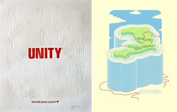
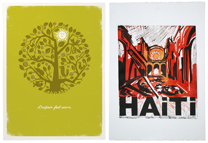
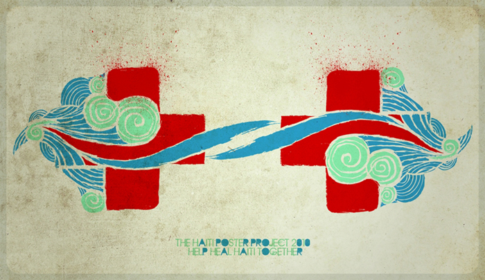
The Haiti Poster Project has been up and running for quite a while now...some kind folks got together and sent out a call for posters. Designers submit 25 editions of an original poster to sell through the website. The profits go to help Doctors Without Borders, and so far there are 438 posters! They're still accepting submissions, and there are many beautiful posters already listed. My school's AIGA student group submitted several posters (here, here, here, and here), and there are plenty more that I haven't checked out. If you're interested in submitting, you can read the guidelines here.
left Unity*, a gorgeous blind deboss on cotton paper by Catherine Lorenzo Realce of design and letterpress studio visualchemist. right Sew, a screenprint by Thomas Jennings of The Half and Half
left L'espoir Fait Vivre, a screenprint by Josh Emrich of The Tenfold Collective. right Haiti, a relief print by Tim Hartman.
Together in Harmony, digital print by Arturo Wibawa
design*sponge mentioned it a while ago and included my poster in the round-up. Made my day!
Labels:
posters
5.18.2010
cupcake-pa-looza
I have an internet, umm, err...problem. I currently have six windows open, and each window features at least six tabs. Most more. The idea is that if I leave a website open in a tab I will figure out what to do with it, whether that means bookmarking it three months later or actual application of the knowledge offered. I'm usually fearful that it will get lost in my bookmarks (which it will), and digital hoarding is a lot less clutter-ful than in real life...right?
Anyway, I've had the link to Ming Makes Cupcakes open since someone blogged about it months ago. I also happen to have a bit of a cupcake problem. Ming's photographs are all SO beautiful and everything looks so tasty. The actual recipes aren't that daunting either. Some day in the near future, I'm going to pick a recipe (likely out of a hat, it'll be that difficult) and make them. Cupcakes are just the best, and Ming knows what's up.

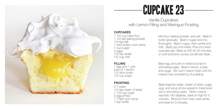
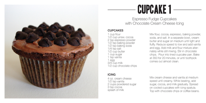
Ming's website also features some tasty looking cookies and "savories." If she keeps this up, I'll be addicted.
Anyway, I've had the link to Ming Makes Cupcakes open since someone blogged about it months ago. I also happen to have a bit of a cupcake problem. Ming's photographs are all SO beautiful and everything looks so tasty. The actual recipes aren't that daunting either. Some day in the near future, I'm going to pick a recipe (likely out of a hat, it'll be that difficult) and make them. Cupcakes are just the best, and Ming knows what's up.


Ming's website also features some tasty looking cookies and "savories." If she keeps this up, I'll be addicted.
5.15.2010
off le desktop
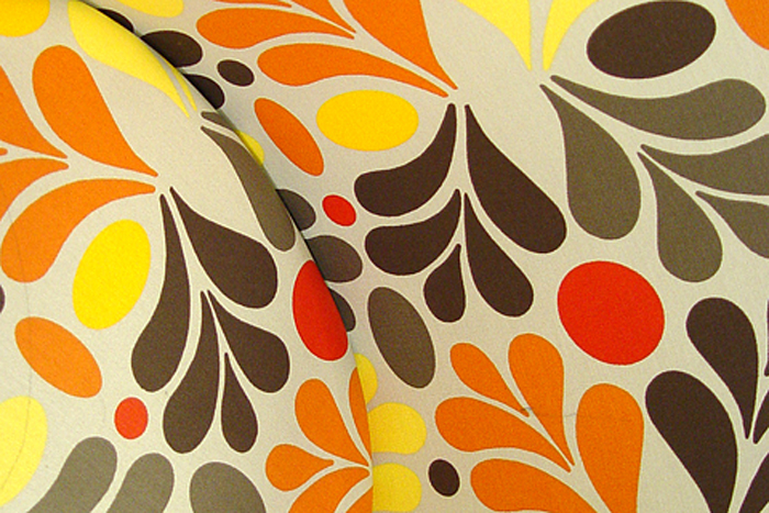
I have no idea where this image came from, but I saved it to my desktop a while ago. I'm not sure I could ever own patterned furniture with this much intensity, but IKEA makes it easy to dream, right?
5.11.2010
holy wowza gelato
Package design and I have a bit of an odd relationship. I really appreciate packaging that is well-designed, but there's a lot of stuff out there that's just fine. Not overly dandy, just slightly above average. It takes something significant to get me excited.
That said, I am so jazzed about this gelati (I assume that's like gelato) packaging by Truly Deeply.
I'd never heard of them before digging around in the archives of Lovely Package, but from the looks of their site, they've got a ton of awesome work.

 I love the way they communicated the idea "what dreams taste like" through collage. The combination of dream-like and flavor-related images and unification through color create a completely unique feel that fits each flavor so well. Not only is the design perfectly suited for the product, it's wonderfully inspirational. Ice cream/gelato/sorbet are things that are already appealing, so it's nice to see someone play with the design to make something fresh.
Now if we could only get this stuff in our grocery stores...
That said, I am so jazzed about this gelati (I assume that's like gelato) packaging by Truly Deeply.
I'd never heard of them before digging around in the archives of Lovely Package, but from the looks of their site, they've got a ton of awesome work.

 I love the way they communicated the idea "what dreams taste like" through collage. The combination of dream-like and flavor-related images and unification through color create a completely unique feel that fits each flavor so well. Not only is the design perfectly suited for the product, it's wonderfully inspirational. Ice cream/gelato/sorbet are things that are already appealing, so it's nice to see someone play with the design to make something fresh.
Now if we could only get this stuff in our grocery stores...
Labels:
packaging
5.09.2010
Animal Portraits
These have probably been around the blog-block a time or two, but I recently came back to Berkely Illustration on Etsy. Not only do these animal portraits make me laugh, the color palettes are unique and the illustrations are excellent...I can't pick just one.

I would love to put one (or two) of these in my kitchen (or really anywhere) and at $10 for a 5 x 7, that's a realistic possibility for the near future!

Labels:
illustration
5.08.2010
calculated colors: bright florals
I think I might be inspired by color palettes more than anything else. There's a certain possibility possessed by simple squares of color, as if they're calling out, "Aren't I unique and great? Make me yours!"
So I usually do.
I originally saw this image along with some other beauties on What Possessed Me and scooted on over to its original home at Dinosaur Designs.
Sometimes colors just look nice together, right?
 This is a little ridiculously feminine, but lately I've been really drawn to bold red-oranges paired with softer pinks.
And I would die a little if that floral arrangement magically appeared in my house. Such beautiful peonies.
So I usually do.
I originally saw this image along with some other beauties on What Possessed Me and scooted on over to its original home at Dinosaur Designs.
Sometimes colors just look nice together, right?
 This is a little ridiculously feminine, but lately I've been really drawn to bold red-oranges paired with softer pinks.
And I would die a little if that floral arrangement magically appeared in my house. Such beautiful peonies.
Labels:
calculated colors,
cmyk,
rgb
Subscribe to:
Posts (Atom)

